Comparing Game Metrics Against the Past
Looking at today's numbers alone makes it hard to tell whether a metric is high or low, and checking performance after a live event or an update calls for a comparison with an earlier point in time. Hive Analytics lets you set a period comparison on charts and dashboards to see the base period, the comparison period, and the rate of change in one screen. You can choose a Relative Date, which shifts along with the reference date, or a Fixed Date, which stays on a specific date — use a Relative Date for a recurring point like the same weekday last week, and a Fixed Date to track change against a specific point such as an event start date.
Looking at today's user count or revenue alone makes it hard to tell whether a metric is high or low. The same number can mean an increase from the past or a drop from the usual level, depending on what it's compared against.
To see the direction and size of a change accurately, you need to check the current period and the comparison period together. To avoid missing an important change while switching dates or moving between charts, comparing the current and past numbers in a single chart matters.
When Game Operations Needs a Comparison Baseline
Operations managers need to check whether user count, revenue, and content engagement are moving in the intended direction after a live event or an update. To judge the situation quickly, they need to look not only at the current value but also at how much it has increased or decreased compared with the same point last week or a specific reference date.
For metrics you check regularly, you can set a comparison period that shifts along with the reference date. Or you can fix a meaningful point, such as an event start date or the time before an update, to check performance since that point. Choosing the comparison basis that fits the analysis purpose lets you handle both routine monitoring and checking performance since a specific point efficiently.
Period Comparison in Hive Analytics Charts
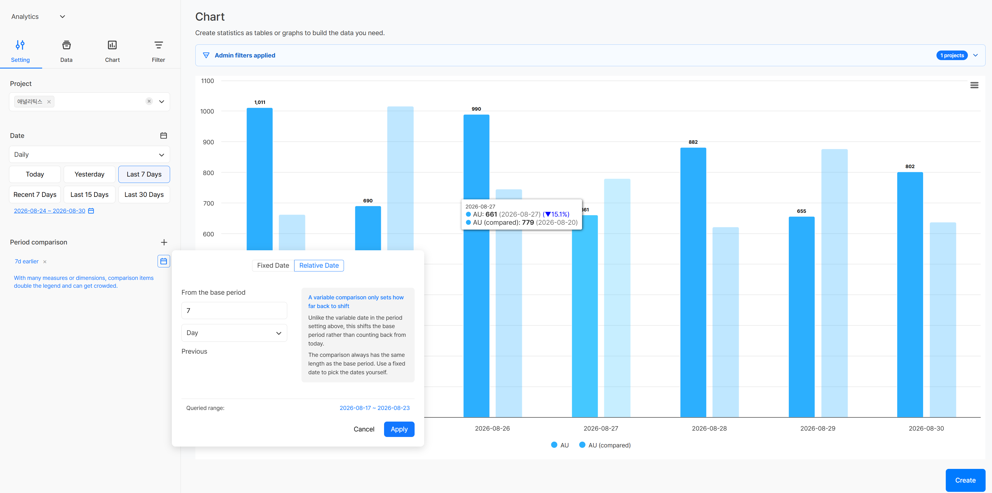
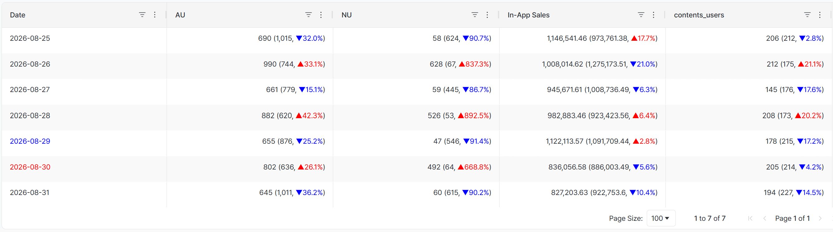
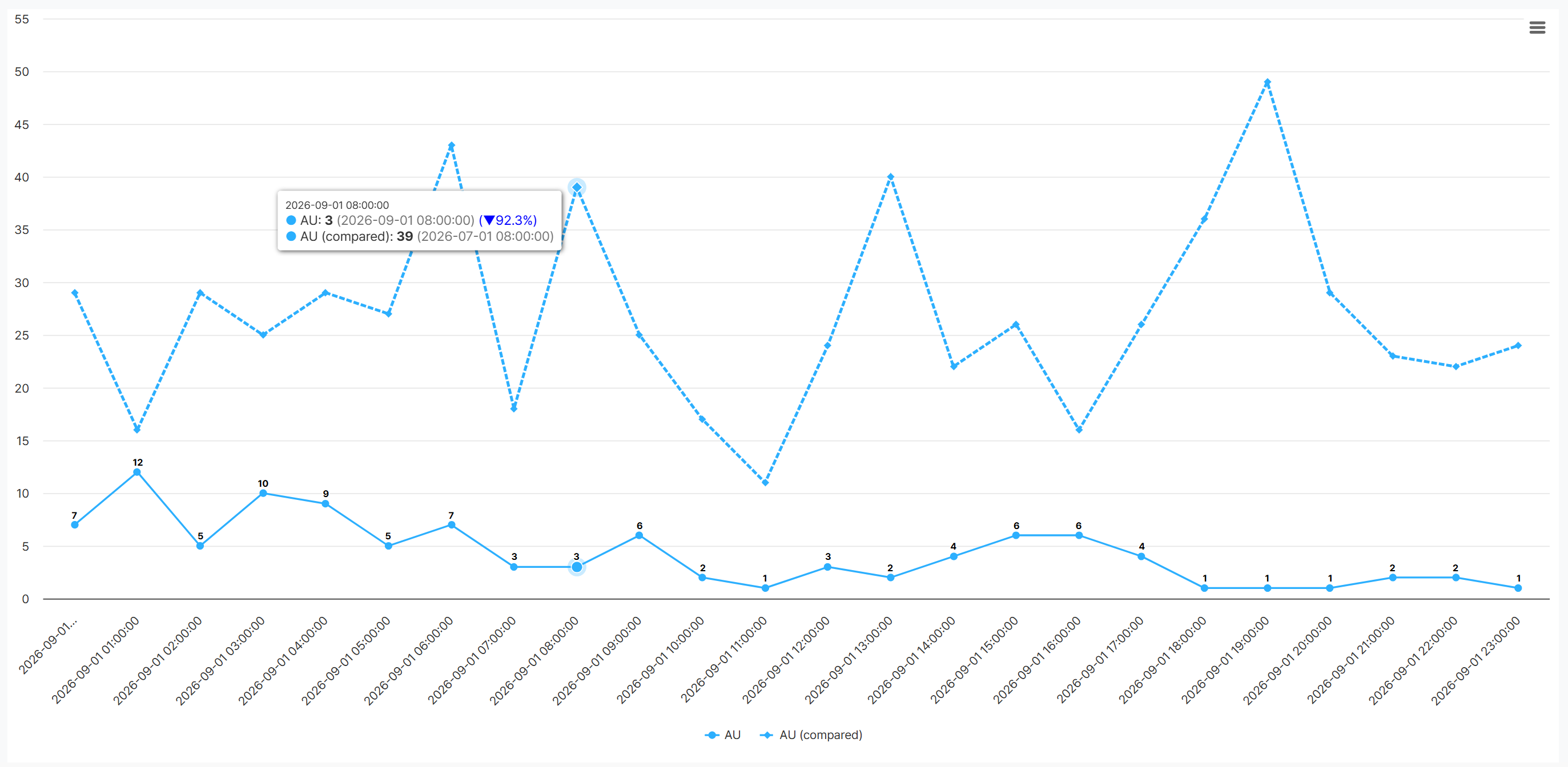
Setting a period comparison on a chart lets you see the base period's value, the comparison period's value, and the rate of change in one screen. It works with tables, bar charts, and line charts, so you can compare exact values, differences by item, or trends over time in whichever form fits your purpose.
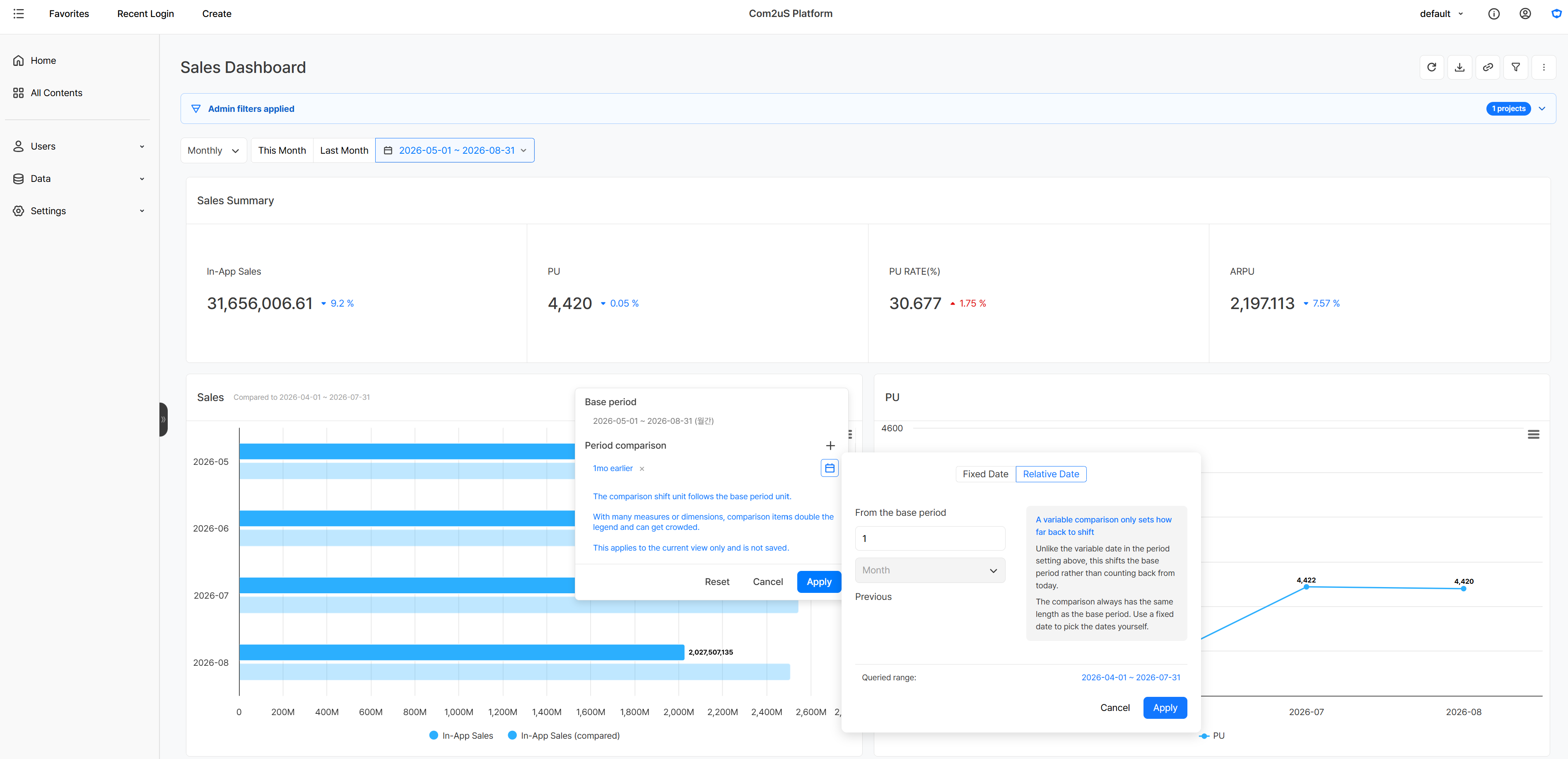
You can choose a Relative Date or a Fixed Date for the comparison period. A Relative Date keeps the same interval — such as N days earlier — even when the reference date changes, which works well for comparing against a recurring point like the same weekday last week. A Fixed Date sets a specific date as the comparison basis, so even as the reference date changes you can keep comparing against the same point, such as an event start date or the time before an update.
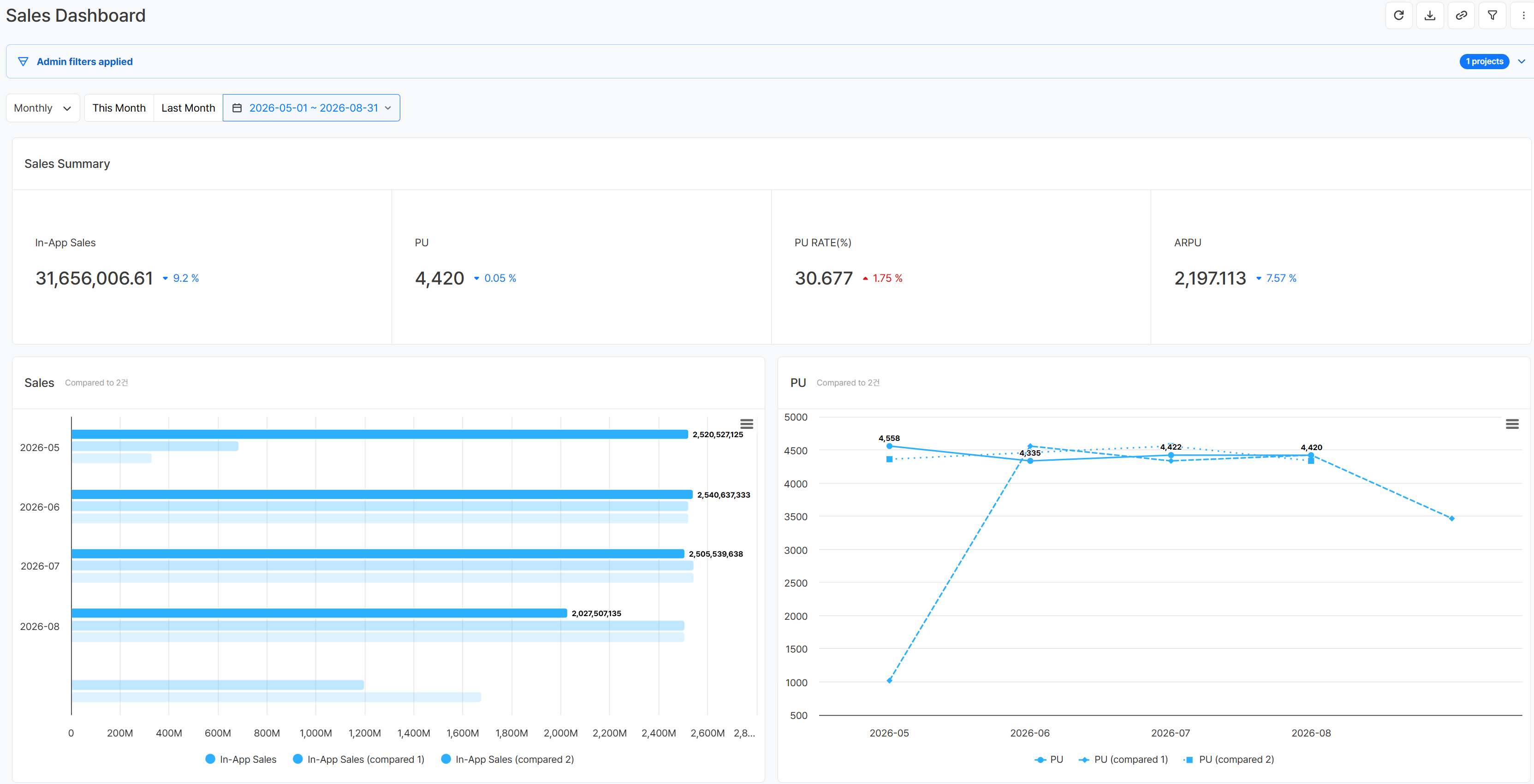
When you set and save a period comparison while creating or editing a chart, any dashboard that uses that chart also shows the base period's and comparison period's values and rate of change right away. On a dashboard you've already set up, you can also apply a comparison basis to each chart on the fly, so you can look at change from an earlier period on an existing operations dashboard without building a new screen.
Comparing Operations Metrics With an Earlier Period
Using a Relative Date and a Fixed Date, you can compare changes in operations metrics on charts and dashboards against whichever basis fits your purpose — the same weekday last week, an event start date, and more.
Comparing Against the Same Weekday Last Week
Setting a Relative Date to 7 days earlier lets you check the value and rate of change for the same weekday last week every time you change the query date. Comparing user count, revenue, and content engagement metrics regularly helps you quickly spot items with an unusually large change.
Checking Change Against an Event Start Date
Setting a Fixed Date to a live event's start date or the time before an update lets you keep comparing against that same point even as the query date changes later on. You can see how participant count and revenue have changed since the event started, or check whether user response holds up compared with before an update.
Looking at Change Across Several Comparison Periods Together
Setting several comparison periods on a single chart lets you compare the base period with different past points at the same time. Add a recurring interval, such as last week or last month, as a Relative Date, or set the start dates of several events as Fixed Dates, to look at the direction and size of change against each point together. Building a chart with the comparison results into a dashboard also lets you see in one screen whether a key metric increased or decreased against each period.
Get Started with Hive Analytics
Applying a period comparison to charts and dashboards lets you see your current game metrics alongside the values and rate of change from an earlier period in one screen. Use a Relative Date for routine monitoring and a Fixed Date to check change since a specific point, so you can build the comparison basis that fits your purpose.
Hive Analytics is a game-focused analytics solution that compares game data collected through the Hive SDK between the current and a past period, and analyzes it in charts and dashboards. Start now with Hive Analytics to quickly see the change after a live event or an update, and efficiently check the metrics you need for operations decisions.