Viewing a Game Metric's Composition by the Basis You Choose
Hive Analytics' pie chart shows each item's value and share of the total measure together, and you can choose the ratio basis as either date or dimension. Using date as the basis shows which point in the period accounted for the largest share; using dimension shows how the user environment — such as country or OS — differed by date. Keeping only the items you need in the legend recalculates their relative share so you can compare a finer breakdown.
Composition Changes That Overall Numbers Don't Show
A game metric such as user count or revenue tells you the overall scale, but it's hard to tell which date or which user environment produced that result. To find out, you'd have to look up the numbers for each date or environment separately and calculate each one's share of the total.
You'd have to repeat that calculation every time the period or the dimension you're analyzing changes, and if you exclude some items, you'd have to recalculate the share based on what's left. To compare differences in composition efficiently, you need to see each item's value and its share of the total together in one screen.
Data Analysis That Calls for Reading a Share Quickly
When you analyze game data, you need to tell whether a change is concentrated on a specific date or stems from the composition of the user environment, such as country or OS. Comparing the share lets you identify the date or user group where the share stands out.
The basis for the ratio differs depending on whether you're checking each date's contribution across the whole period or comparing each date's breakdown by dimension. Choose date or dimension as the basis to fit your analysis purpose, then keep only the items you need and look at the relative share again — this pins down what to analyze further and narrows the scope.
The Pie Chart in Hive Analytics
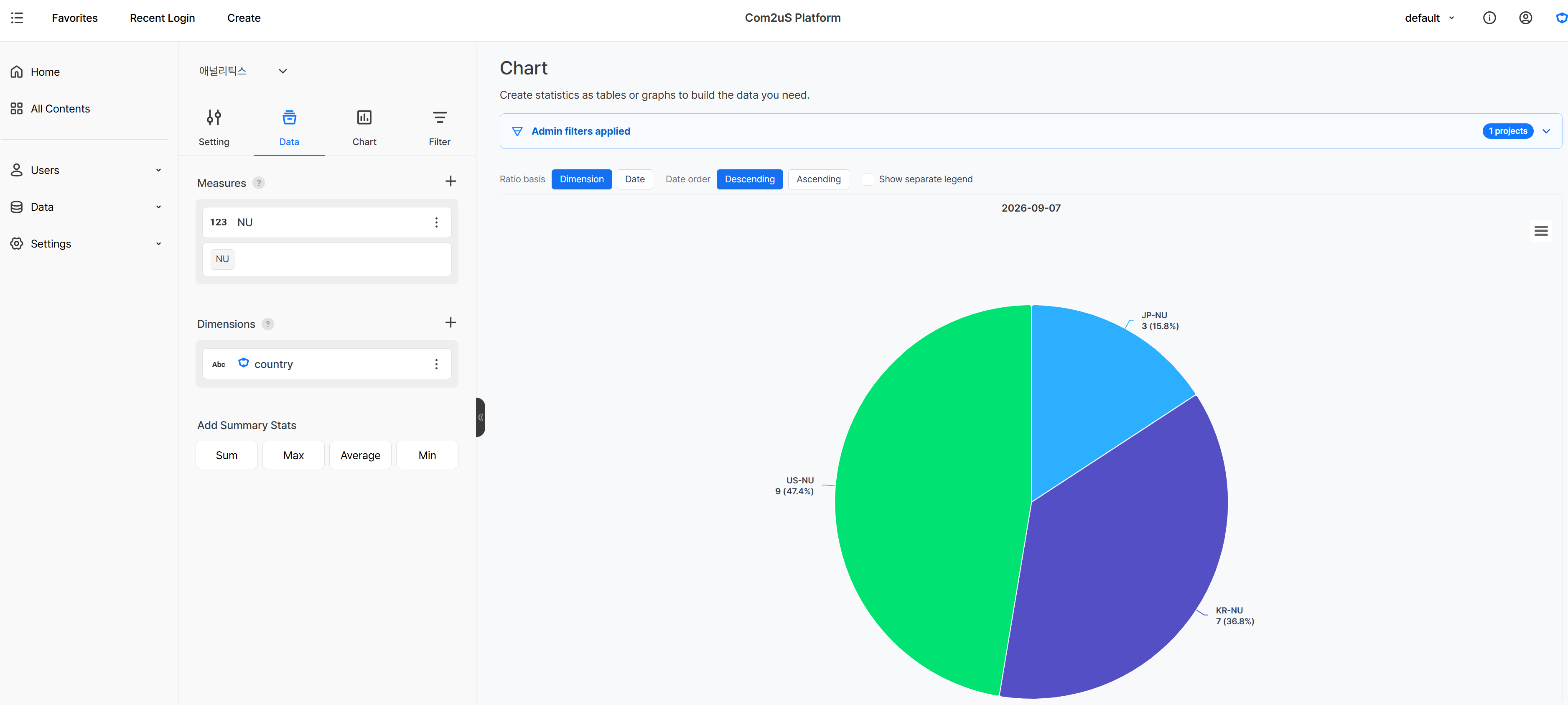
The pie chart in Hive Analytics charts shows each item's value and share of the total measure together, and you can choose the ratio basis as either dimension or date.
Choosing date as the ratio basis shows the share each date in the period accounts for in the measure. Without adding a dimension, the measure's date-by-date composition appears as a single pie chart; add a dimension, and you can view the date share broken out by each dimension.
Choosing dimension as the ratio basis shows what dimensions make up the metric measured on each date. When you add several dimensions, such as country and OS, the combination of dimension values appears as a single item, so you can compare the composition by date.
Excluding a value in the legend recalculates the ratio by treating the remaining items' total as 100%. Use this when you want to keep only the items you're interested in out of the whole composition and look at their relative share.
Analyzing Composition by the Basis You Need
Using the pie chart's ratio basis and legend, you can check the ratio by dimension and by date separately, and keep only the items you're interested in to look at their relative share again.
Checking the Ratio by Dimension
Add dimensions such as country and OS and choose dimension as the ratio basis, and you can see which dimension combination makes up the purchase count on each date. Even when the total purchase count is similar, you can compare whether the share by country or OS shifted on a particular date.
Once you find the item where the composition changed, you can break out that country's or OS's purchase trend into a separate chart for further analysis.
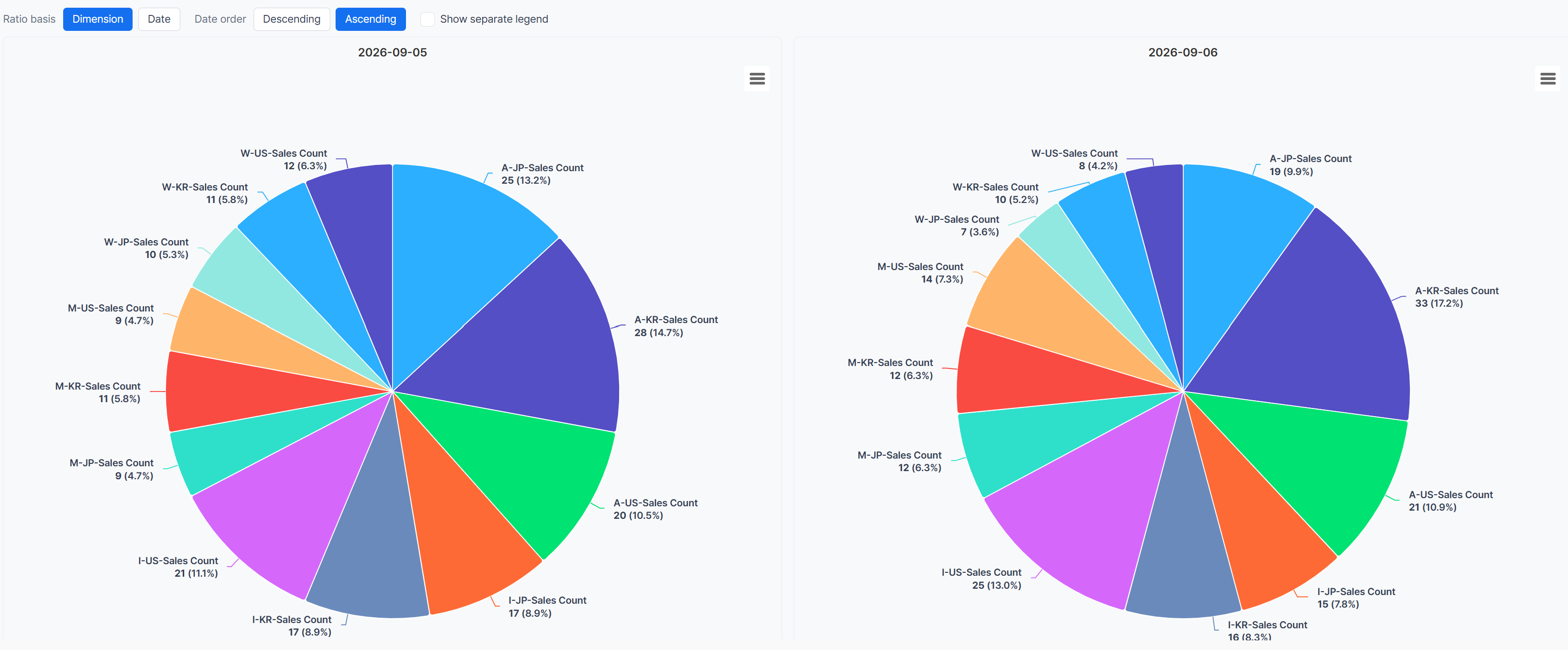
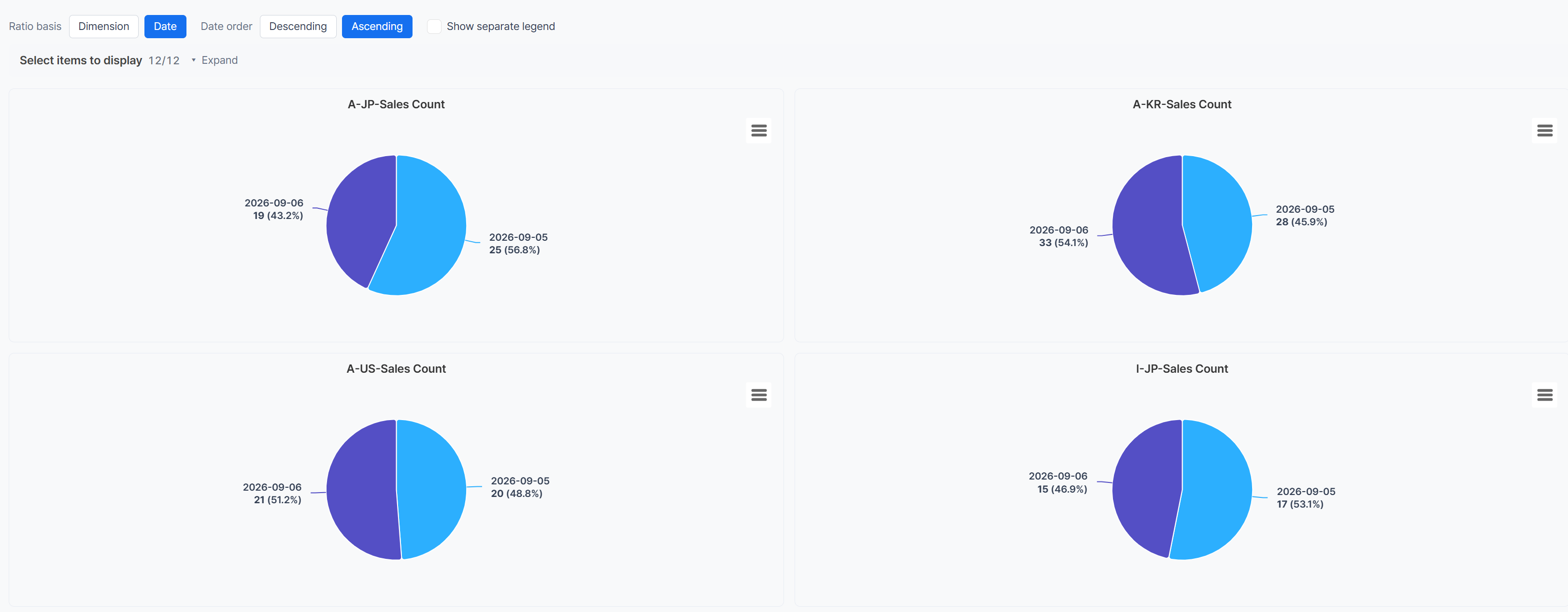
With a dimension already added, choosing date as the ratio basis also shows how each dimension combination's measure breaks down by date in the period. In the example screen, you can compare the share each OS-country combination's purchase count accounts for on 2026-09-05 and 2026-09-06.
Recalculating the Composition With Only the Items You Care About
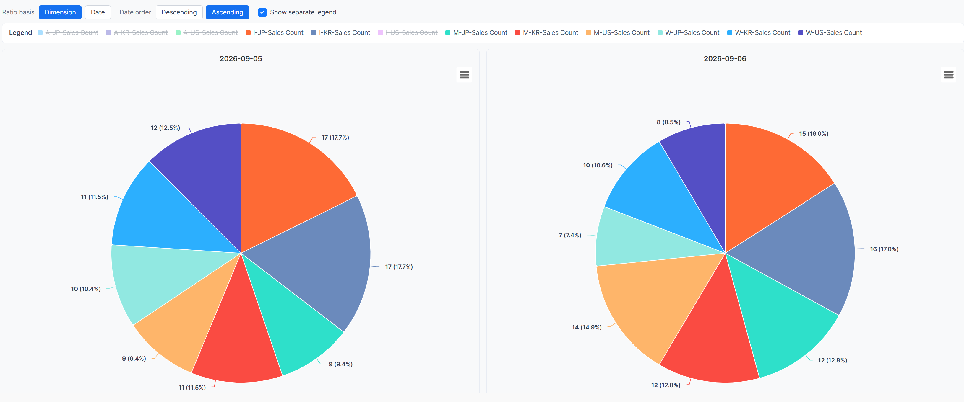
Excluding a value you're not analyzing in the legend recalculates the composition based on the items left on screen. In the example screen, a legend item that accounted for 10% or more of the previous chart's 2026-09-05 data was excluded, so you can look again at the relative purchase share among the remaining OS-country combinations.
A value that looked small among all items can show a clearer difference once it's recalculated within the range you're focused on. Use this to keep only a specific country or OS group and check the detailed composition.
Get Started with Hive Analytics
Add the metric you want to analyze as the measure in a chart, and depending on whether a dimension is added and which ratio basis you choose, you can view the composition by date or by dimension. Adjust the legend to keep only the items you need and look at the relative composition again.
Hive Analytics is a game-focused analytics solution that visualizes game data collected through the Hive SDK as a ratio by date and dimension, and lets you analyze composition changes in charts and dashboards. Start now with Hive Analytics to view a game metric's composition from whatever perspective you need.